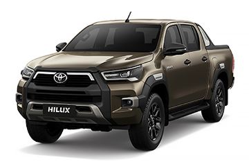
![Toyota HIlux vintage brochures]()
While the world over is looking back at the 2010 decade, we decided to do the same. But instead of just looking back in the decade, we’re flipping through some classic car brochures and comparing the differences through the generations.
![current generation Toyota Hilux]()
As you know, the Toyota Hilux succeeded the Toyota Light Stout and the Toyota Briska. The brand hoped that the Hilux will present a luxe pick-up truck option to the segment’s growing demand.
The first Toyota Hilux was launched in 1968, and this was how the brochure accompanying the truck looked like.
![first generation Toyota Hilux cover]()
It’s somewhat similar to the brochures that we can get today. Pictures of the truck’s exterior and interior along with sketches of the truck’s chassis dominated the brochure.
![Toyota Hilux first generation brochure]()
![Toyota Hilux first generation brochure]()
Other than the pastel colours used compared to the current gen’s dark and chic designs, the brochure’s contents are nothing we’re not familiar with.
![Toyota Hilux first generation brochure]()
![Toyota Hilux first generation brochure]()
The brochures in the 70s were very different. Instead of the second gen Hilux taking centre stage, the cover of the booklet features 2 men who seem to be best friends.
![Toyota Hilux 2nd gen brochure]()
They could also be seen throughout the booklet discussing about the Hilux as if the booklet is telling a story and getting personable.
![Toyota Hilux 2nd gen brochure]()
![Toyota Hilux 2nd gen brochure]()
The second gen brochure is only the start of the Hilux’s marketing campaign geared towards a more lifestyle focus. As can be seen in the third generation’s brochure.
![Toyota Hilux 3rd gen brochure]()
Gone were the story telling duo and instead the booklet is filled with pictures of the Hilux gracing in its natural habitat. The booklet seems to be very American centric too with California printed on the cover and accompanied by a picture of a white woman.
![Toyota Hilux 3rd gen brochure]()
![Toyota Hilux 3rd gen brochure]()
Notice the difference? By 1983, the arrival of the fourth generation Hilux also herald a new chic black background for the truck as well.
![Toyota Hilux 4th gen brochure]()
We can’t help but get Knight Rider vibes from the brochure. Coincidently, Knight Rider was also airing on TV channels when this generation’s Hilux arrived. It also helps that a certain Marty McFly drives a truck in the extremely popular Back to the Future movie.
![Toyota Hilux 4th gen brochure]()
![Toyota Hilux 4th gen brochure]()
The brochure for the fifth generation Hilux seems to have dropped all pretence and Toyota seem to think that the truck should speak for itself.
![Toyota Hilux 5th gen brochure]()
The fifth generation’s brochure is all about the big titles, clean backgrounds and to the point text.
![Toyota Hilux 5th gen brochure]()
![Toyota Hilux 5th gen brochure]()
This simplicity flowed into the sixth generation Hilux booklet as well. The front didn’t even show the Hilux’s picture and flip to the third page and it’s all about the various variant that the Hilux has on offer. In a very Japanese flavour, I might add.
![Toyota Hilux 6th gen brochure]()
![Toyota Hilux 6th gen brochure]()
![Toyota Hilux 6th gen brochure]()
![Toyota Hilux 6th gen brochure]()
Subsequent brochures of the Toyota Hilux are more familiar to our generation of car buyers. So we'll end it with the sixth generation. What do you think about the vintage brochures?


